I started a December 2013 post with the following. I was angry at the number of unreadable books being produced, and went on to name a few and why.
That anger remains. Nothing has changed, the situation has worsened. What prompted me to write again on this subject was one book. Read on after the introduction…
Reading in Bed
Posted on December 6, 2013
“Those of you who have seen my book, whatever you may think of its contents, will probably agree that it is a beautiful object. And if the physical book, as we have come to call it, is to resist the challenge of the eBook, it has to look like something worth buying and worth keeping.”
Julian Barnes
From Julian Barnes’s acceptance speech at the 2011 Booker Ceremony, on winning with his novel, The Sense of an Ending.
A Guardian article states at length how the book buying public are now being seduced by a book’s appearance as well as its content, how more care is being taken in the production and appearance of books. Generally, I don’t believe this is true.
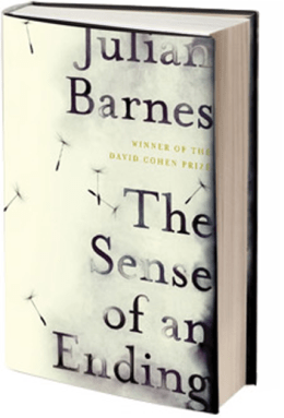
The Sense of an Ending is a physically beautiful object; a compact hardback with dust wrapper containing a nice but simple design, all put together with good quality material. I think all books are beautiful in their own way, but that is another discussion. Barnes’s book is a beautiful object, but how practical is it? By that I mean how well does it do its job, perform its practical purpose of being read, and being read with ease, without unnecessary hindrances? The answer to that is: not very well.

Reading in Bed 2
I had been struggling for a couple of months to find some decent fiction to read, starting and not finishing several books. While I found the books disappointing at some stage, they were at least readable as physical objects: mainly they had wide inner margins, would lay flat on a table without springing back and could be read comfortably in bed.
I was thus relieved to find that Zadie Smith had a new book in paperback (she hasn’t had that many in sixteen years). Here was one of my favourite authors whose book I would surely get through. I ordered it from Amazon and looked forward to it.
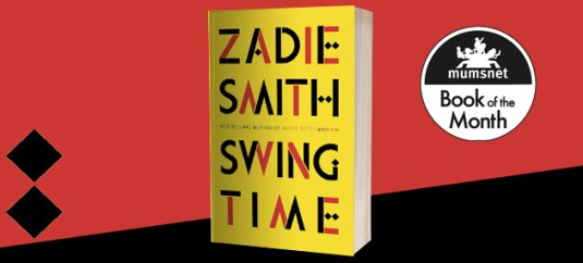
The book, Swing Time, duly arrived, and due to me writing a novel during the day, I saved it for bedtime. Attractively bound in red, yellow and black, it was a beautiful object, one would be proud to own it, display it on one’s book shelves. The trouble was that the person who designed it had given no thought to the people who would actually attempt to read it.

The inner margins were narrow, and the book would not flatten out. On every page the inner third of the text was constantly on a curve because of this. The narrow inner margins accentuated the problem. I know many books are like this (wrongly) but this is the worst case I have seen. It made the book hard to read anywhere, but in bed, almost impossible. The book had to be forced open as far as it would go to read the inner text. Not only that, depending on the light source and direction, reading either left or right page threw a shadow over the opposite page, so not only was one having to constantly bend the book back as far as it would go, it was also necessary to keep shifting the page to catch the light upon the shadows.
Every page was like this, all 453 of them. I took two months to read the book because I was never comfortable; two or three short chapters a night. Consequently, I never really got in to the flow of the book. The surprising thing is that this title was published by Penguin, who are usually (not always) pretty good. They have a long history of publishing physically readable books. Penguin do not say who designed the book, they give a cover designer and not much else. The last page includes a short history of Penguin, boasting of their dedication to reading; they also say:
“We still believe that good design costs no more than bad design, and we still believe that quality books published passionately and responsibly make the world a better place.”

The above is stated at the end of Swing Time – ironic or what? Penguin certainly forgot any design principles with the design of this book. What is the problem? Do designers have no connection with reading? Do they have no idea that the book is going to be read? Have they never read a book? Should Penguin be aware of this?
Should Penguin take care that their book design is for readers first and aesthetic reasons second?
YES!
I am aware that publishers are considering readers less and less. When I have written before my intention was to keep track of the bad publishers and expose them. That turned out to be a mammoth task, impossible. However, I will write when I find a book like Swing Time, a book that Penguin was aware would be a bestseller yet still published in a near unreadable format.
Were Penguin even aware that they had done this? I think not. They have actually sold shoddy goods, sold something which does not do what it is supposed to do – they have sold a book that is not possible to read without difficulty. That is crazy – publishers selling unreadable books.
I emphasise that Penguin are not the main culprits, they have just produced something awful here. I hope it is not the beginning of a trend.
It is a simple thing to publish books in a readable format. It’s not expensive. So why don’t they do it?

Lack of awareness or even care?
Keep an eye on what you read and tell publishers when they produce something unreadable. Tell them in your reviews or email them. It’s so easy to do.
“Whatever you like to read – trust Penguin.”

