Reading in Bed 2


I started a December 2013 post with the following. I was angry at the number of unreadable books being produced, and went on to name a few and why.

That anger remains. Nothing has changed, the situation has worsened. What prompted me to write again on this subject was one book. Read on after the introduction…

Reading in Bed

Posted on December 6, 2013

Those of you who have seen my book, whatever you may think of its contents, will probably agree that it is a beautiful object. And if the physical book, as we have come to call it, is to resist the challenge of the eBook, it has to look like something worth buying and worth keeping.”

Julian Barnes

From Julian Barnes’s acceptance speech at the 2011 Booker Ceremony, on winning with his novel, The Sense of an Ending.


A Guardian article states at length how the book buying public are now being seduced by a book’s appearance as well as its content, how more care is being taken in the production and appearance of books. Generally, I don’t believe this is true.


The Sense of an Ending is a physically beautiful object; a compact hardback with dust wrapper containing a nice but simple design, all put together with good quality material.  I think all books are beautiful in their own way, but that is another discussion.  Barnes’s book is a beautiful object, but how practical is it?  By that I mean how well does it do its job, perform its practical purpose of being read, and being read with ease, without unnecessary hindrances?  The answer to that is: not very well.

 soae


Reading in Bed 2


I had been struggling for a couple of months to find some decent fiction to read, starting and not finishing several books. While I found the books disappointing at some stage, they were at least readable as physical objects: mainly they had wide inner margins, would lay flat on a table without springing back and could be read comfortably in bed.


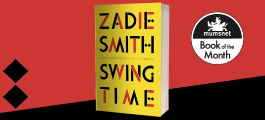
I was thus relieved to find that Zadie Smith had a new book in paperback (she hasn’t had that many in sixteen years). Here was one of my favourite authors whose book I would surely get through. I ordered it from Amazon and looked forward to it.


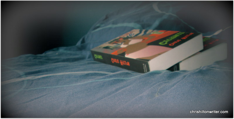
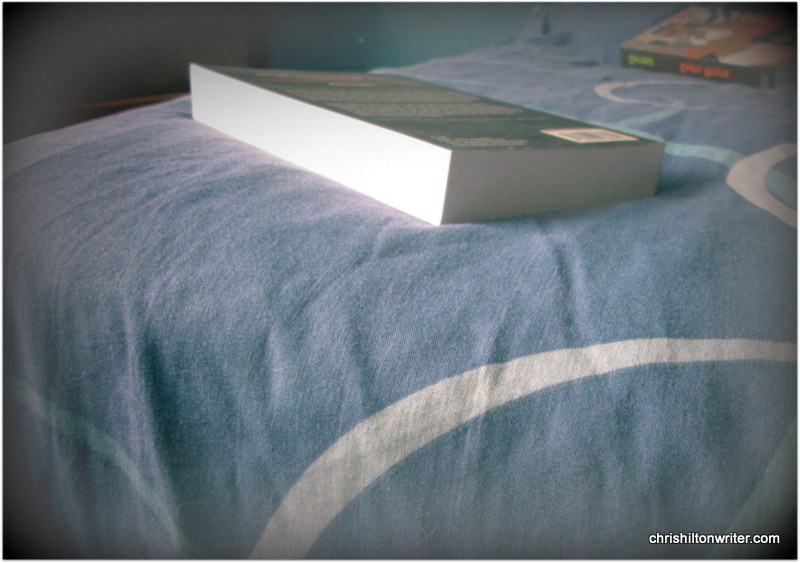
The book, Swing Time, duly arrived, and due to me writing a novel during the day, I saved it for bedtime. Attractively bound in red, yellow and black, it was a beautiful object, one would be proud to own it, display it on one’s book shelves. The trouble was that the person who designed it had given no thought to the people who would actually attempt to read it.


swing-time jpeg


The inner margins were narrow, and the book would not flatten out. On every page the inner third of the text was constantly on a curve because of this. The narrow inner margins accentuated the problem. I know many books are like this (wrongly) but this is the worst case I have seen. It made the book hard to read anywhere, but in bed, almost impossible. The book had to be forced open as far as it would go to read the inner text. Not only that, depending on the light source and direction, reading either left or right page threw a shadow over the opposite page, so not only was one having to constantly bend the book back as far as it would go, it was also necessary to keep shifting the page to catch the light upon the shadows.


Every page was like this, all 453 of them. I took two months to read the book because I was never comfortable; two or three short chapters a night. Consequently, I never really got in to the flow of the book. The surprising thing is that this title was published by Penguin, who are usually (not always) pretty good. They have a long history of publishing physically readable books. Penguin do not say who designed the book, they give a cover designer and not much else. The last page includes a short history of Penguin, boasting of their dedication to reading; they also say:


“We still believe that good design costs no more than bad design, and we still believe that quality books published passionately and responsibly make the world a better place.”


 images


The above is stated at the end of Swing Time – ironic or what? Penguin certainly forgot any design principles with the design of this book. What is the problem? Do designers have no connection with reading? Do they have no idea that the book is going to be read? Have they never read a book? Should Penguin be aware of this?


Should Penguin take care that their book design is for readers first and aesthetic reasons second?


YES!pback


I am aware that publishers are considering readers less and less. When I have written before my intention was to keep track of the bad publishers and expose them. That turned out to be a mammoth task, impossible. However, I will write when I find a book like Swing Time, a book that Penguin was aware would be a bestseller yet still published in a near unreadable format.


Were Penguin even aware that they had done this? I think not. They have actually sold shoddy goods, sold something which does not do what it is supposed to do – they have sold a book that is not possible to read without difficulty. That is crazy – publishers selling unreadable books.


I emphasise that Penguin are not the main culprits, they have just produced something awful here. I hope it is not the beginning of a trend.


It is a simple thing to publish books in a readable format. It’s not expensive. So why don’t they do it?

                        pback2


Lack of awareness or even care?

Keep an eye on what you read and tell publishers when they produce something unreadable. Tell them in your reviews or email them.  It’s so easy to do.


                                   “Whatever you like to read – trust Penguin.”


chriscuba-001


Still Reading in Bed…

IMG_0369

Below are two paragraphs from my December blog, Reading in Bed. I return, reluctantly, to it now.

Julian Barnes’ Booker winning novel is a beautiful object; I read it over a few nights, entirely from a prone, on my back, position. And it is not a practical object. For a very simple and infuriating reason: its inner margins are too narrow. The book requires an uncomfortable and impractical two hands to be able to see the whole of the text; in other words, without forcing the book wide open with two hands the inner text on both pages will disappear into the fold of the book; one is constantly tilting the book this way and that to read the end of the sentences on the left-hand page and their beginning on the right hand page. This is unusual with hardback books, but this is a small book.

.

Although this fault is most noticeable in bed – I suppose publishers will protest that books are not designed to be read in bed (if not, they should be) – it is almost as annoying when reading anywhere in any way. If, like me, you love books as ‘physical’ objects then you will resent having to practically break their backs to read the central text. Apart from the discomfort and the detraction of pleasure, you are damaging the book, shortening its life – the act of doing this, bending the two halves of a paperback hard against its spine makes me angry; apart from the inconvenience which has been added to what should be a pleasure (depending on the book), I resent having to treat a book this way. It should never be necessary.

.

When I wrote that I had also intended to include a survey of the books I owned: note the good ones and the bad ones, unmask the guilty publishers and provide some kind of guide. It proved too time-consuming and difficult and there was no consistency. The same publishers would provide both the readable and the unreadable. I was slightly disappointed that there was no pattern, nothing to complain about (except generally) to anyone.

.

.

However I’ve recently bought two books that confirm absolutely the faults that I mention. So I’ll report on them. Perhaps others could do the same. Maybe a pattern will emerge.

.

A while ago I purchased Far From The Tree from Amazon. Written by Andrew Solomon, it is about parents, children and the search for identity. The reviews were spectacular, far too many good reviews for them to have been an old-pals-act. It’s the sort of book I cannot resist, particularly as I believe there are very few decent books being published, or at least widely publicised.

.

But when it arrived from Amazon, I first thought of returning it, then slotted it into my shelves, probably never to be read. It will be in a charity shop within the year. Why? 958 pages have been crammed into a too small paperback. The book measures 8.5” x 5.3” x 2” (215 x 135 x 50); its type is fairly small, but not quite too small with fairly narrow line spacing. But that is not the main problem. The problem is the inner margins and flexibility. The inner margins are never wider than a half inch and the book is not flexible enough to open flat, making it difficult at any time to view a whole page in comfort. In my view it would be impossible to read in bed; I won’t even try. As much type as possible has been squeezed into the smallest possible space. The book is published by Vintage; it is printed by Clays Ltd of St Ives, although I assume printers just follow instructions. I consider the book a useless object: Price – £11.99.

.

Now, I know putting 958 pages into a readable paperback represents a challenge. I checked some of my books for a comparison. Edward Gibbon’s Decline and Fall of the Roman Empire has 1114 pages. It is printed in a slightly smaller paperback and has smaller type. But it is flexible. The book opens flat at any point and is easy to read, in bed or otherwise. It was published in 2005 by Penguin Classics.

.

An alternative is simply to print a larger paperback. Proust’s Remembrance of Things Past, Volume 1 and 2, have 1360 pages and 1288 respectively. Wordsworth Editions (God praise them) have simply published the book at 9 x 6 x 2.25 (230 x 150 x 55). It is flexible at all points and has large inner and outer margins. Heavy to read in bed, perhaps, but no fault of the publisher. Incredibly, it is available, new, at £6.99 (£5.24 from Amazon). I think Wordsworth always produce readable volumes. If I’m wrong, please let me know.

.

Just to prove inconsistency, I’ve just checked my version of Anna Karenina. It’s also published by Penguin (2001). It has narrow, inconsistently sized inner margins and is not flexible. To me it’s unreadable. Off to the charity shop with it. The Wordsworth edition is £1.99, I’ll buy that one.

.

082

.

The other book I bought (today) was purchased in Waterstones: Constellation of Genius: 1922: Modernism and all that Jazz, by Kevin Jackson. I looked through it and it seemed fine. On getting it home for a closer look it is not so good. It consists of diary type entries for the year 1922. The diary entries are set towards the middle of the page. That’s OK. But the inner margins are inconsistent, barely a quarter of an inch in places, making the entries hard to read. The book is fairly flexible and quite nicely produced, but why this inconsistency? On pages 250 and 251, for example, the type almost merges at the centre of the page. All through the book there are massive outer margins, just wasted space; I wouldn’t care at all if outer margins were narrow. Most of the book is fine (just), but tiny inner margins for no reason – it seems so careless The book is published by Windmill Books, part of The Random House group, at £9.99.

.

According to the Amazon reviews the book may be badly or nonexistently edited too. That’s something I’ll return to another time. It seems that many publishers are only interested in rushing books out as quickly as possible, with little thought for quality.

That’s it. Rant over. Please let me know of other cases of thoughtless printing (and good printing too). I don’t suppose we can do anything about it, but we can try.

chriscuba-001

Reading in Bed

“Those of you who have seen my book, whatever you may think of its contents, will probably agree that it is a beautiful object.  And if the physical book, as we’ve come to call it, is to resist the challenge of the eBook, it has to look like something worth buying and worth keeping.”


From Julian Barnes’s acceptance speech at the 2011 Booker Ceremony, on winning with his novel, The Sense of an Ending.

A Guardian article states at length how the book buying public are now being seduced by a book’s appearance as well as its content, how more care is being taken in the production and appearance of books. Generally, I don’t believe this is true.


The Sense of an Ending is a physically beautiful object; a compact hardback with dust wrapper containing a nice but simple design, all put together with good quality material.  I think all books are beautiful in their own way, but that is another discussion.  Barnes’s book is a beautiful object, but how practical is it?  By that I mean how well does it do its job, perform its practical purpose of being read, and being read with ease, without unnecessary hindrances?  The answer to that is: not very well.

IMG_0368

I read frequently in bed.  That may not be where the majority of reading hours are put in, but it is the place where my reading most often takes place – every night without fail.  Actual reading time can be as little as one minute before the object of reading falls onto my face to remind me that I’ve fallen asleep; it can also be hours or occasionally a whole book.  In bed is where one judges the practicality of a book.  I believe most of us must read while lying on our back, holding the book above our face; that way when sleep comes it’s possible to place the book on the floor or on the bedside table and quickly get to perfect slumber without unnecessary interruptions, such as changing position drastically or rearranging pillows, cushions and covers.  If, like me, you do read this way, then you should know what I mean about the practicality of reading a book as opposed to its beauty.


Julian Barnes is right.  His Booker winning novel is a beautiful object; I read it over a few nights, entirely from a prone, on my back, position.  And it is not a practical object.  For a very simple and infuriating reason: its inner margins are too narrow.  The book requires an uncomfortable and impractical two hands to be able to see the whole of the text; in other words, without forcing the book wide open with two hands the inner text on both pages will disappear into the fold of the book; one is constantly tilting the book this way and that to read the end of the sentences on the left-hand page and their beginning on the right hand page.  This is unusual with hardback books, but this is a small book.


Although this fault is most noticeable in bed – I suppose publishers will protest that books are not designed to be read in bed (if not, they should be) – it is almost as annoying when reading anywhere in any way.  If, like me, you love books as ‘physical’ objects then you will resent having to practically break their backs to read the central text.  Apart from the discomfort and the detraction of pleasure, you are damaging the book, shortening its life – the act of doing this, bending the two halves of a paperback hard against its spine makes me angry; apart from the inconvenience which has been added to what should be a pleasure (depending on the book), I resent having to treat a book this way.  It should never be necessary.


Why are so many books made this way?  And who is producing them? I can’t decide if this is just a quirk of printing or penny-pinching.  I was unable to decide if some publishers habitually printed unreadable books, if some never erred or if the whole business is a lottery.  I was going to put together an extensive list but found that margin width is completely random, there is no pattern to it; a publisher may release a book with wide margins followed by one with narrow margins: same price, no reason. It appears to be haphazard. Rather than try to catalogue the problem, here are just a few examples of what I have been reading lately.


Geoff Dyer’s Working the Room (Canongate) is impossible to read in bed without forcing the covers back with two hands (not a natural position).  Using the natural stance of holding the book between thumb and forefinger reveals the bottom half of the text, but the top half disappears into the centre, forcing one to use unnatural, uncomfortable pressure to be able to see the upper text.

A Little Aloud (Chatto & Windus) is not only a marvellous book, its proceeds going to charity, it has really wide central margins to make one-handed reading easy as well as silent or noisy reading in bed – in fact why not read aloud to a loved one in bed?


I had hoped that this would be a modern phenomenon, a sign of the philistinism and greed of the post-modern era, penny pinching publishers saving another £0.0001 per copy by depriving the reader (me!) of reading space and comfort.  It was not to be: A 1998 Penguin edition of Lucky Jim is very mean with its margins.  It requires two hands and needs forcing open at all times because also, without the book open flat there are always shadows to contend with, a hazard for all but those with 20:20 vision.

IMG_0374

Another factor is ‘Give’.  Have you noticed how the better paperbacks allow themselves to be forced flat, you feel as though you are breaking them but you are not – the spine remains uncracked, the glue holds – they are a miracle of design and engineering. I present two examples: Alone in Berlin (Penguin) 2009, and Leviathan (Fourth Estate) 2009; beautifully put together books, but Alone in Berlin has narrow margins while Leviathan has wide margins; they are both priced at £9.99 – the problem has nothing to do with cost. I don’t think publishers even consider this. The Empty Space by Peter Brooke also has ample room on the inner margin.


The crazy thing is: Who needs outer margins? They are necessary for appearance’ sake but provide no practical purpose. Why not shorten the outer margin and give the difference to the inner margin? I hope I’m not the only person to notice this. Any thoughts?